Download Font CARPE DIEM MARK DEMO
Updated 12/20/2017 1:19:32 PM
Release note:
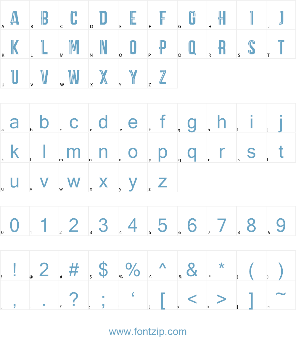
Carpe Diem it's a clear and modern Sans Serif with a geometric skeleton.
This kind of fonts was born in England during 1800s for the purpose of making
letters simple and with less frills.
Despite there are a lot of fonts with similar characteristics, Carpe Diem is trying to find
its niche in the anonimous fonts area, adding a personal interpretation to the same
simple font.
Definitely has a contemporary, familiar and 'perceptible' look.
CARPE DIEM MARK: transformed with help of simple lines, enriched, with a nice and
accurate graphic cut, readable, with a modern informal style. Suitable for a highly
young target, Carpe Diem Mark definitely gives a catchy visual impact.
| Files In Archived | |
|---|---|
| 1 | CARPE DIEM MARK DEMO !.otf |
| 2 | CARPE DIEM MARK DEMO !.fcp |
| 3 | Tavola-carpe-diem-mark.png |
| 4 | webCARPE DIEM MARK DEMO !.css |
| 5 | webCARPE DIEM MARK DEMO !.eot |
| 6 | webCARPE DIEM MARK DEMO !.ttf |
| 7 | webCARPE DIEM MARK DEMO !.woff |
Using CARPE DIEM MARK DEMO font on your website
Customize preview CARPE DIEM MARK DEMO Font
CARPE DIEM MARK DEMO Font Sample Character